Wednesday, July 25, 2012
Final Portfolio Project
Here is the final product the result of this class. This portfolio includes all of the design work I created within the past six weeks and some other work I have created in the past. I learned such a great amount of things in such a short period of time regarding the three most vital programs in design. Hope you have enjoyed my journey. Feedback is always welcome :)
Tuesday, July 24, 2012
Final Surrealist Project
I decided to combine my passion for photography and for poetry in my surrealist project. I went on a trip to Portland, Oregon and took a slew of pictures I always wanted to showcase. Thanks to photoshop I was able to combine both of these in a dream-like piece that functions like a portrait of myself. I am even featured in the work as the girl in transition in a sepia tone. This is a second piece I grew very proud of and I was pleased to her all of the constructive criticism on my critique. For the most part, I do not feel I am going to change it because I feel the work says enough on its own as it is. What do you think about my work?
Tuesday, July 10, 2012
Ideation- Surrealist Vladimir Kush
I was drawn to Vladimir Kush's surrealist art work because of his appreciation for space and landscapes. I applaud his different take on metaphorical realism in that his style is all his own yet he pays homage to the artists before him. Below are some example of his magical work:
Surrealist Project- rough drafts
Portrait Critique
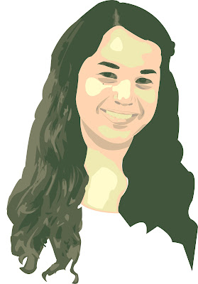
We had our critique for our portrait yesterday. I feel that I was as honest and thorough as I could have been. I was praised for my craftsmanship and my attention to detail on my face and hair. If I could have changed anything about my portrait I think I would have reconsidered the pattern I used as the background. Thought I initially liked the colores, the "í" is somewhat distracting in that it is much lighter color than my initials. I think I might go back and change this for my own records. Apart from that, I am quite happy with this piece and I will continue to try to improve should time allow.
Thursday, July 5, 2012
Photoshop 101
Final Portrait(s)!!!
Early Draft of Pattern
This is the pattern I created for my portrait with my initials... I think I will change for the final.
Subscribe to:
Comments (Atom)


